
Brand Center
The visual system, banner set, logo variants, video skeletons and usage rules — all served from this domain, filterable and reachable without JS.
SYSTEM PHILOSOPHY
Numbered, language-tagged, accountable
The visual system is built on the same principle as the engine itself: every asset is numbered, language-tagged and accountable. From VA-01 to VA-40, each narrative visual carries a single idea — the number contract, the evidence chain, reversibility, live verification — and exists not to decorate but to carry that idea into a slide or a news story. The TR and EN sets pair one-to-one yet never mix: an English visual on a Turkish surface breaks the language of the number contract. Every card's alt text and caption come from the banks; use them rather than inventing your own. In the banner set, each of the 24 standard sizes is pixel-verified; downloading the right size always beats rescaling and blurring. Logo proportions and colors are locked to the guide; the gold is never brightened, the navy never lightened. The video section holds no published film and pretends none — what lives there are production-ready skeletons: storyboards, voiceover scripts, cut plans and subtitles.
FIVE SECTIONS
The asset center
This center is not a download list but an annotated usage guide: every asset carries language, format and a usage note; filtering degrades gracefully because all cards are always on the page.
Visuals
VA-series narrative visuals The core set that carries the narrative weight of decks, stories and pages. Every card holds the downloadable SVG source, 1600×900 PNG/WebP derivatives and the alt text/caption from the banks.
37 SVG+PNG+WebPBanners
24 standard ad sizes Every standard placement from leaderboard to social card. PNG is primary, 2× WebP serves retina; sizes are verified in the filename.
24 PNG · 2× WebPLogos
Primary + variants The official mark in dark- and light-surface variants. Four formats download from one card; proportion and clear-space rules live in the guide.
19 varyant · 5 formatVideo
Storyboards, voiceover, social cuts The full production skeleton for the 3-minute and 30-second formats. No published video — stated honestly.
4 skeleton filesBrand Documents
Usage rules and inventory Guide and manifest: the two sources for correct brand use, with SHA digests.
guide + manifestUSAGE PRINCIPLES
Logo and brand rules
The system
Primary identity: hexagon-shield + check symbol with the "WebTrustEngine" wordmark ("Trust" in gold).
Variants: primary horizontal · primary stacked · symbol-only (gold/white/black/navy) · wordmark-only · compact (WTE) · monochrome (black) · document header · social avatar · app icon · watermark · favicon master.
Colors
- Navy:
#0F1E33(ground) · Panel:#1A2E4A - Gold:
#C9A227(accent) - White / White:
#FFFFFF· Gri / Gray:#AAB3C2
Minimum size
Below these, use the symbol only.
Clear space
50% of the symbol height on all sides.
Background rules
- Dark:
*_dark_bgveyamonochrome_white.
Misuse (don't)
No distortion, recoloring, shadows/glows/gradients, rotation, re-typesetting, or low-contrast placement.
Typography
Placement
- header:
primary_horizontal_dark_bg(SVG). - Footer
- document cover:
document_headerveyaprimary_stacked. - social profile:
social_avatar(400-1080 px). - app icon:
app_icon+ maskable set. - Watermark
Favicon
brand/favicon/: favicon.ico (16+32+48) · favicon-16/32/48 · apple-touch-180 · android-192/512 · maskable-192/512 · safari-pinned-tab.svg · site.webmanifest · browserconfig.xml.
Formats
EPS not produced in this environment; SVG+PDF cover vector needs.
Claim safety
Never pair the logo with guarantee, A+, ranking or pricing claims.
THE SYSTEM The visual system is no accident: VA's grammar
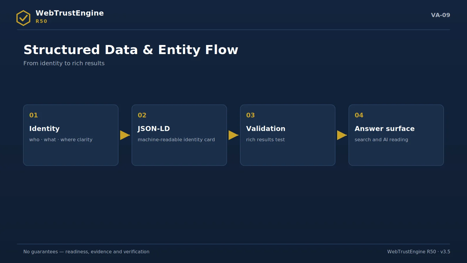
All forty visuals speak one grammar: deep navy ground for the engine's 'night cockpit' identity, gold accents for verified evidence, the fine grid for measurability. A VA number is not a filename but a narrative address — VA-17 carries the capability map, VA-21 the evidence package, VA-25 the claim matrix — and these addresses summon the same scene in the guide, on the site and in decks.
The naming scheme is part of the inventory too: the VA-XX_TOPIC_LANG pattern states language and subject before the file is even opened; 1600×900 is the master size, 800×450 the preview. The goal of this discipline is not aesthetic monotony but unmixability — putting a wrong-language visual into a deck becomes structurally hard.
LANGUAGE SPLIT TR/EN as twin production, not translation
Every visual's TR and EN versions are produced separately; the copy is not a translation squeezed into a box but a twin that reads natively in its language. The rule is firm: TR visuals on TR surfaces, EN on EN — mixing signals carelessness at best and counts as a finding in brand audits. The filters on this page ease selection; with JavaScript off all cards remain on the page, because access is never held hostage to a script.
SOCIAL CUTS How to use the social cuts and video skeletons
The files in the video section are not 'published films' but production skeletons: the storyboard speaks to the shoot, the voiceover script to the studio, the cut plan to the social editor, the VTT/SRT files to the accessibility layer. Preparing a cut always follows the same order — skeleton, scenes from the visual system, subtitles, a claim-safety read. The last step is non-skippable: if even one frame implies a 'guarantee', that frame is rewritten.
FIVE CASES
Good and bad use: five short cases
1 · A slide: right is placing a VA visual with its caption and moving the alt text into speaker notes; wrong is overprinting your own slogan on the artwork. 2 · A news image: the 1200×630 social card is ready as-is; cropping and re-proportioning a banner is wrong — the correct size already exists in the set. 3 · A dark UI: pick the gold-outlined logo variant on dark; stamping the primary navy mark onto dark kills the contrast. 4 · A bilingual report: TR visuals in the TR section, their EN twins in the EN section; serving both languages with one visual breaks the language of the number contract. 5 · A tight space: below roughly 300 pixels use the mark alone instead of the full wordmark, and keep the guide's clear-space rule.
SIZE PICKER
Choosing a banner size for six common placements
Six placements cover most real use. Top-of-page display: 728×90 leaderboard on desktop, 320×100 on mobile. In-article: 300×250 remains the universal rectangle; 336×280 where the column is generous. Sidebar campaigns: 300×600 half-page carries the most narrative. Social link previews: the 1200×630 card — never a cropped banner. Newsletter headers: 600-wide formats sit safely in mail clients. Site-to-site partner strips: 970×250 billboard where the slot allows, 970×90 where height is tight. The set already contains each of these; picking is a lookup, not a design task.
COLOR SYSTEM
Why navy and gold
The palette is functional before it is aesthetic. Deep navy grounds the evidence surfaces — ledgers, manifests, run logs — at a deliberate distance from the promise-language of bright product UIs. Gold is the single accent and is spent sparingly: number cards, critical badges, decision points; a page filling with gold signals something is being over-emphasised. Two neutrals — paper white, ink grey — carry the text layer. Nothing outside these four enters, campaign or not: a consistent palette is the visual counterpart of a consistent claim language. File names follow a contract of their own — brand prefix, asset type and number, language and version suffix — so a reader knows a file without opening it and a script catches the one name that breaks the pattern.
WORKING WITH IT
Working with the visual system, day to day
In daily use the system rewards one habit: start from the manifest, not from the folder. The CSV names every asset with its type, size, language and intended surface; filtering it takes seconds and prevents the classic mistake of grabbing whatever thumbnail looks right. For decks, pull the 1600×900 PNGs and keep captions as written; for the web, prefer the WebP derivatives and keep the SVG source archived for future scaling. Never store edited copies beside the originals — a modified visual with an original filename is precisely the kind of silent corruption the digests exist to catch.
Three quick answers close most questions. May colors be adjusted for a campaign? No — palette consistency is part of the claim language. May a visual be cropped? Only to full-bleed edges that do not cut the diagram; recomposing the artwork counts as redrawing. Who approves new asset requests? The contact page's press/brand lane; nothing is invented outside the sealed set.
One last habit worth adopting: when an asset ships outside the company — to an agency, a publisher, a partner — send the ledger row with it: filename, size, language, digest. Four fields cost one line in an e-mail and save every downstream "which version is this?" thread before it starts. The visual system was numbered for exactly that conversation. Sharing the row is also the polite version of enforcement: partners who receive identity with the asset rarely need correcting later, and corrections that do happen are one reply long, not a meeting — the ledger row settles it. Internally the same row doubles as an audit trail: quarterly, the manifest is walked against the live folders, and any file that drifted from its digest is replaced from the sealed source — housekeeping that takes minutes precisely because every asset carries its identity in its name.
Press-ready pack
Launch copy and 12 media downloads live on the Press page.